DESIGN PRINCIPLES FOR TACTILE GRAPHICS
Keys to Readability
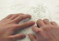
1. Movement + texture = tactual perception
The individual components of the graphic must be spaced so that the reader has room to move the fingers across the area, line, point symbol or label. The components must be a minimum of 1/4" in size to be read as separate textures.
2. 1/8th inch rule
Spacing of 1/8 inch (absolute minimum) between any two elements is required for perception of individual pieces of information. Depending on the production method used and the experience of the reader, 1/4 inch between components may be necessary. (Capsule paper may require 1/4" between components.)
3. Contrast in textures
Adjacent textures must be significantly different from each other to be discriminated. The strength of the texture helps the reader to prioritize information. The most important information is shown with the most important (strongest) textures. White space (also called a dead zone) between areas, around labels within textures enhances contrast between textures.
4. Variety of heights
In addition to changes in texture, changes in height give the reader a clue that the information is different from the previous area covered.
5. Orientation to the graphic
A title for the graphic will orient the reader to the subject and the view. If there is not one in print, a simple title should be added. Example: "Cross-section of an Artery", Aerial View of the Campus". If the print graphic is shown in a 3-D view or at an angle, the tactile should be re-oriented to side and/or face view, depending on content. Both views may be needed for clarity of content. The exception is in math drawings when a 3-D view is required.