DESIGN PRINCIPLES FOR TACTILE GRAPHICS

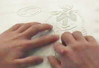
This section provides best practices in tactile graphics design. The techniques are keys to readability, planning and editing, and getting the initial design on paper.

Keys to Readability

1. Movement + texture = tactual perception

The individual components of the graphic must be spaced so that the reader has room to move the fingers across the area, line, point symbol or label. The components must be a minimum of 1/4" in size to be read as separate textures.

2. 1/8th inch rule                                                                           

Spacing of 1/8 inch (absolute minimum) between any two elements is required for perception of individual pieces of information. Depending on the production method used and the experience of the reader, 1/4 inch between components may be necessary. (Capsule paper may require 1/4" between components.)

3. Contrast in textures 

Adjacent textures must be significantly different from each other to be discriminated. The strength of the texture helps the reader to prioritize information. The most important information is shown with the most important (strongest) textures. White space (also called a dead zone) between areas, around labels within textures enhances contrast between textures.

4. Variety of heights

In addition to changes in texture, changes in height give the reader a clue that the information is different from the previous area covered.

5. Orientation to the graphic

A title for the graphic will orient the reader to the subject and the view. If there is not one in print, a simple title should be added. Example: "Cross-section of an Artery", Aerial View of the Campus". If the print graphic is shown in a 3-D view or at an angle, the tactile should be re-oriented to side and/or face view, depending on content. Both views may be needed for clarity of content. The exception is in math drawings when a 3-D view is required.

Planning and Editing

Planning the Graphic

Before you begin your graphic, take a few minutes to "incubate" your ideas.  Try to synthesize the information that you are planning to illustrate.  Think about the meaning you are about to attach to these symbols.

Areas

Lines

Points

Labels

Keys/Legends

 Color

TACTILE GRAPHIC PLANNING SHEET

AREAS

Information

Texture/Material


LINES

Information

Texture/Material


POINT SYMBOLS

Information

Texture/Material


LABELS AND KEY


Title of Graphic:                                        Page:                                    

Text or subject:                                         Student/Agency:                           

Date Assigned:                        Date Needed:                         Production time:                

Source: American Foundation for the Blind, Techniques for Creating and Instructing with Tactile Graphics - Workshop in Atlanta, Georgia (December 6-8, 2001) and Colorado Springs, Colorado (April 25-27, 2002.) Lucia Hasty and Ike Presley


Getting the Initial Design on Paper

There are several ways to efficiently transfer the portion of the graphic you will use to paper or foil. Availability of equipment is the only limit.

Determine size needed

Enlarge graphic on a photocopier, print onto braille paper, if equipment will allow.

Scan the print graphic and use the software to enlarge it.

Scan the print graphic and use drawing software to enlarge and or trace essential elements.

Consider the age of the reader when you make the enlargement. The graphic should be an appropriate size for the reader's hands. Example: A clock face that is sized to fill an entire page is much too large for little hands of a second grade reader.

Transferring the image

Use carbon paper to trace enlarged graphic onto paper.

Tip: If you will be using the collage method of production and you will include tooling (e.g. lead lines to braille label) as well as collage, use carbon paper on both sides of the paper to transfer the image to the paper.

Using a light box, trace the image onto the braille page.

Tip: A permanent marker, such as a Sharpie, will bleed through the paper so that you have the image showing on both sides.

When using aluminum diagramming foil for a master, transfer the drawing to the tissue sheet attached to the back (APH product), then re-attach it to the foil. Since it is translucent, you can trace face up and still see the reversed image when you attach it to the back of the foil. Tool directly through the tissue-eliminate the step of transferring the image again.

If you are using a copier or computer software and printer to copy, create, or enlarge the image, print onto vellum paper. It is translucent, will feed through the copier or printer. Using a light box, place the image on vellum under the braille paper to lightly trace where collage textures will be placed. Turn the braille paper and vellum over to tool lead lines or other lines needed.